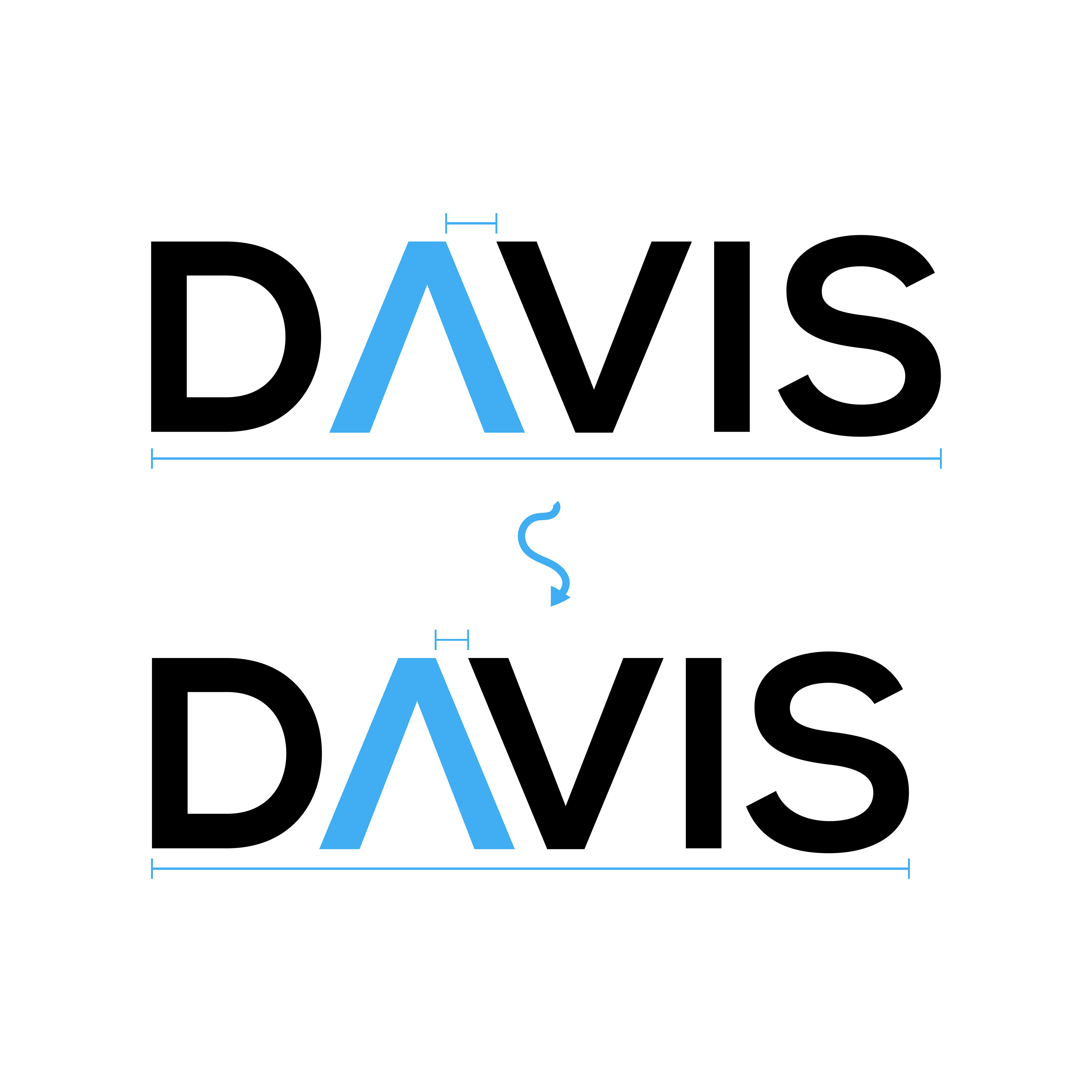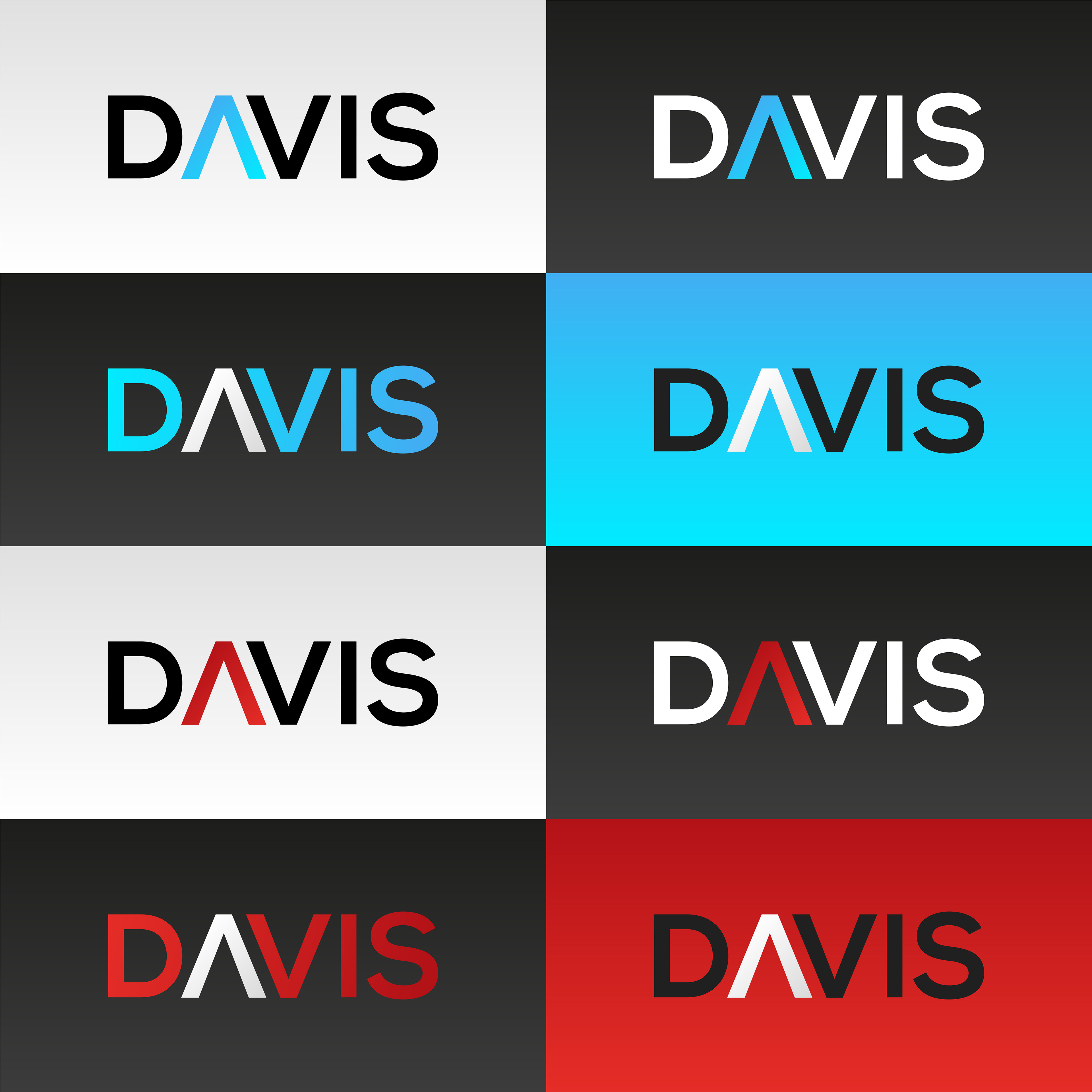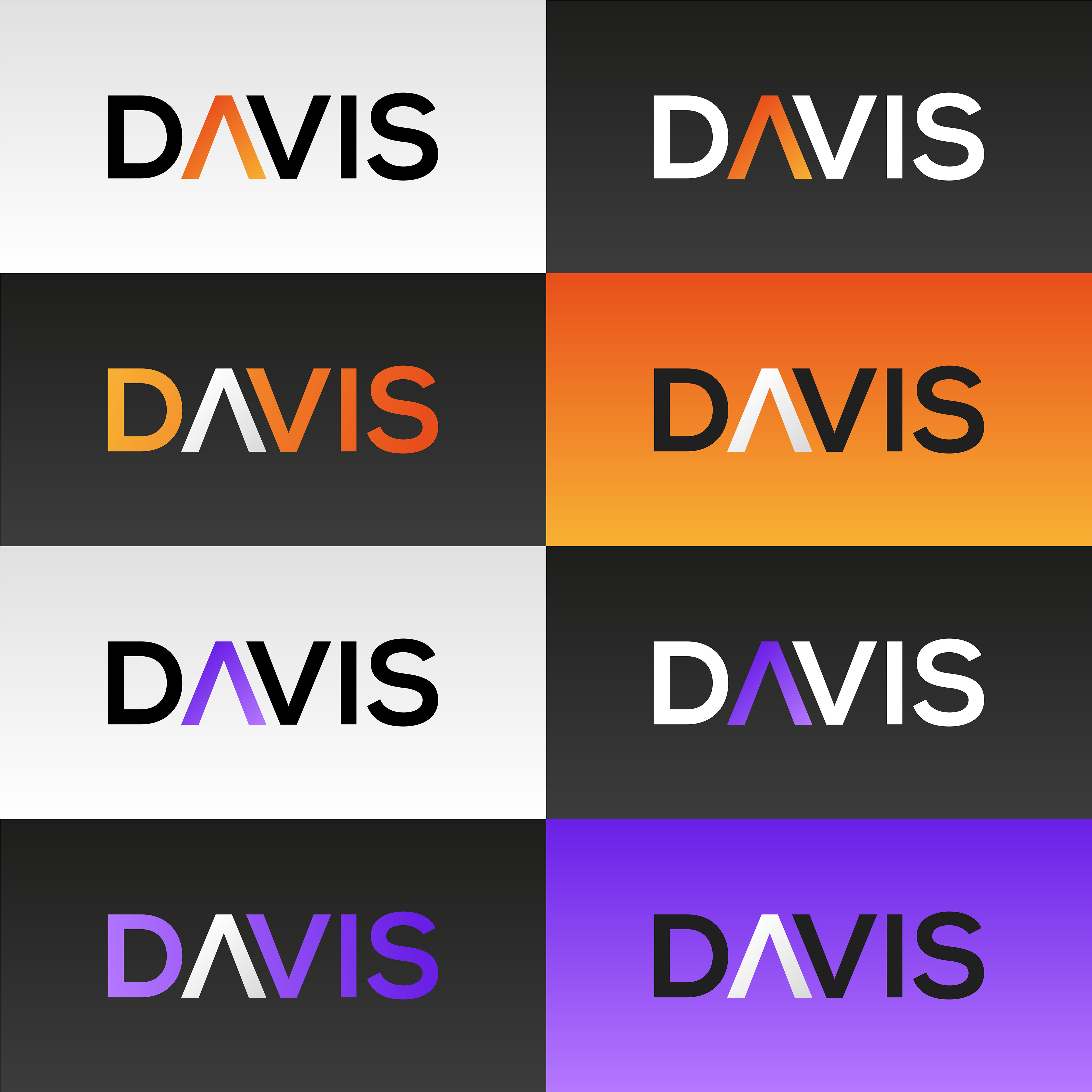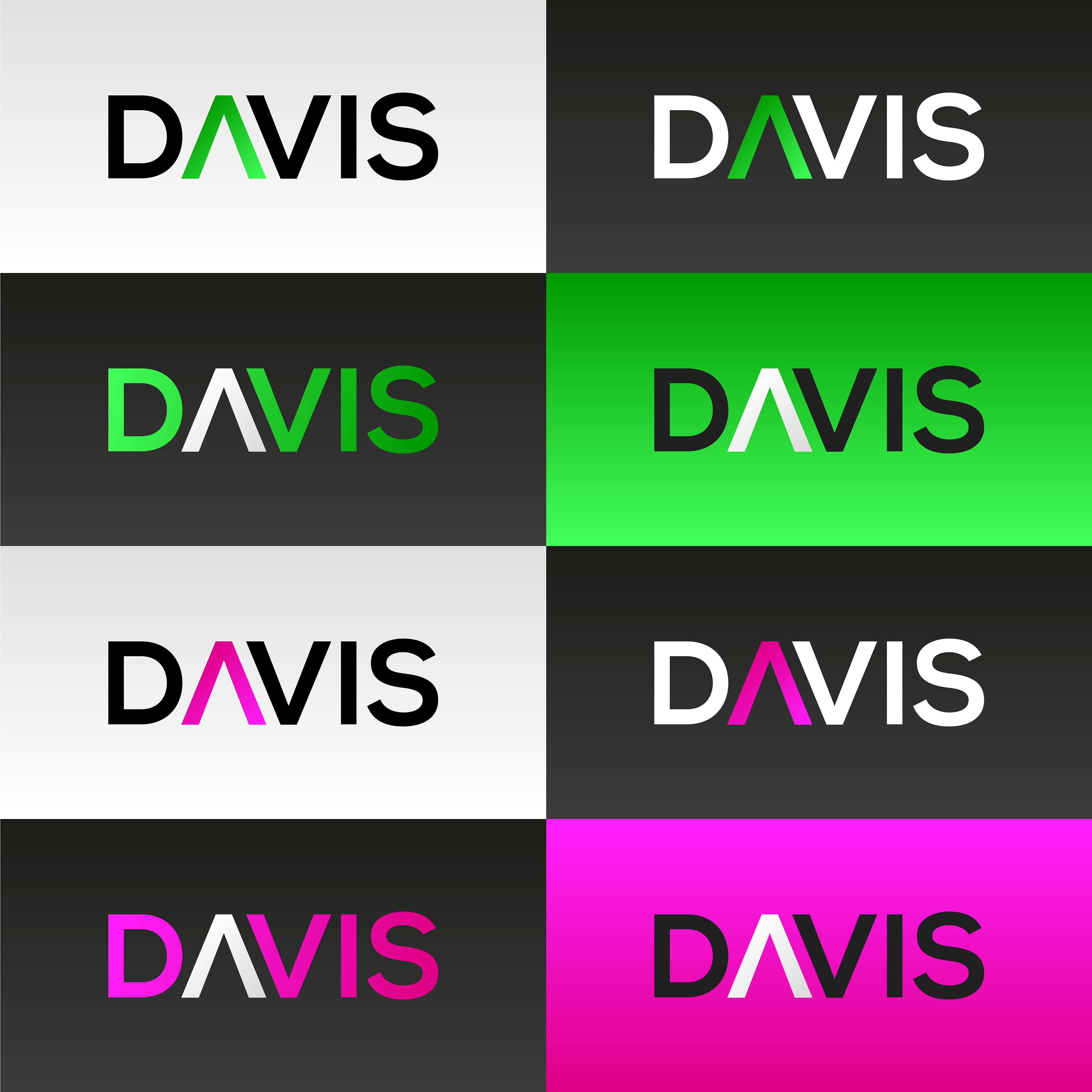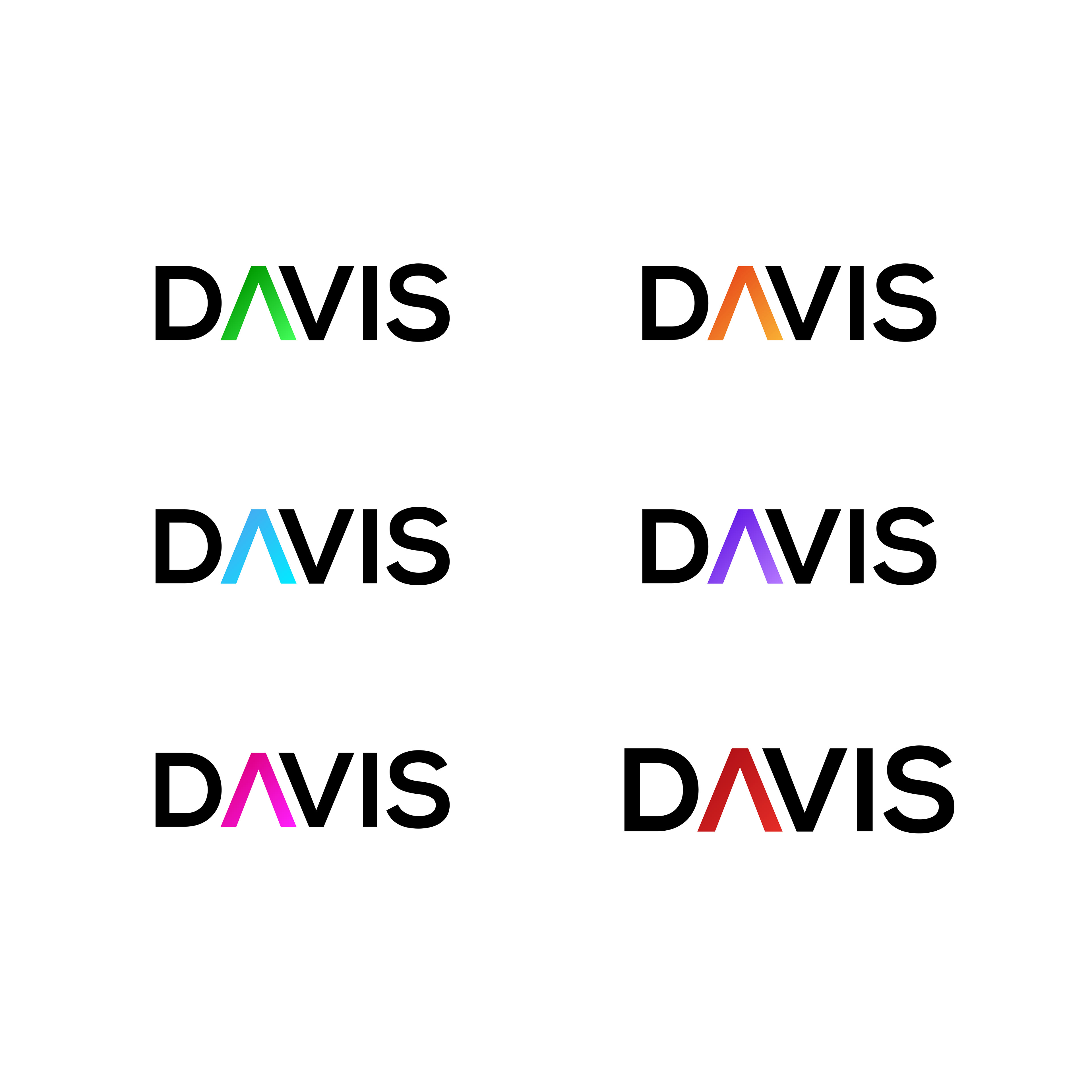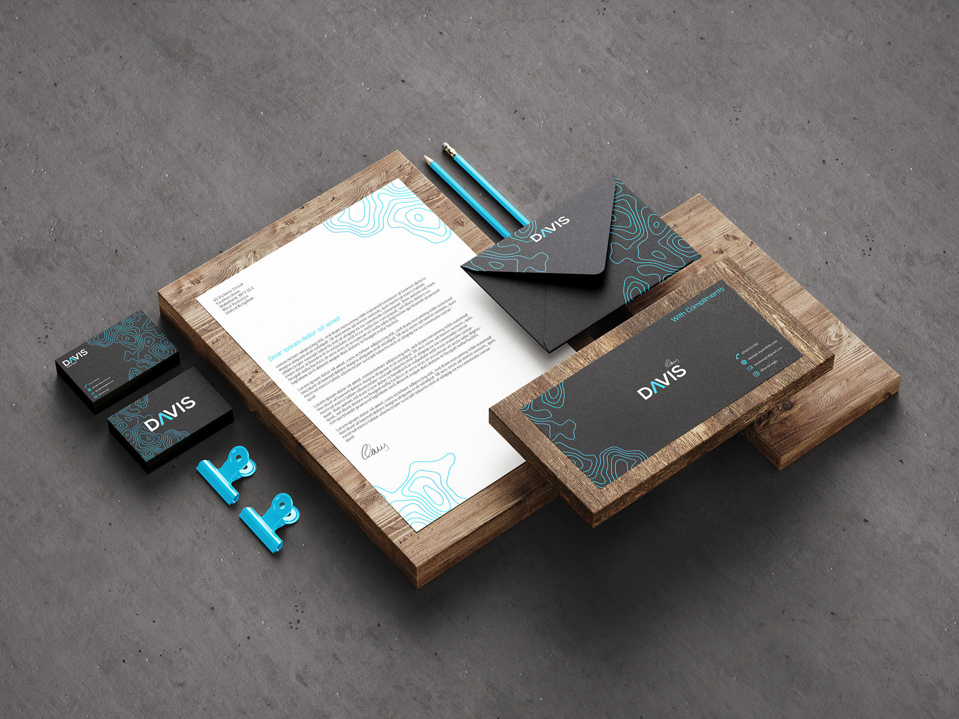

This is a brief that I completed to tackle the problems surrounding my previous personal identity. The issue with my old identity appears dated due to the colour palette and is also a little less refined because of the spacing between the text which makes it look less seamless and therefore breaks the professionalism of the wordmark. I solved this by using an improved colour gradient on the 'A' to help modernise the mark along with a more condensed profile to help with legibility and aesthetic cohesion.